| Pie in pie |
 |
|
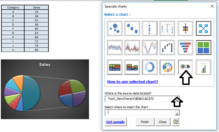
This Excel tool improves the classic pie of Excel, adding a detail serie to be able to visualize the data. You can quickly see important information in your reports in a very fast way. With this graphic you can represent a part of the pie in several parts to improve the analysis of a portion and make easy to distinguish the slices.By means of the pie in pie type of graph you can see a response of several series part by part or a series that represents the total of these proportions Please observe the form of the data in the attached image so that you can create the graph in the correct way. Choose the range to be plotted, the destination and press insert. You must select the data as it is shown in the example. |
 |