| Lines (high, average, low) |
 |
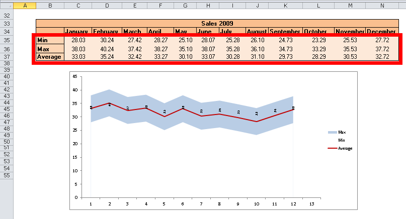
This type of Excel graphic is commonly used to plot average, high , low values in the data. |
| 1.Group your data with the structure as shown in the example. 2.Select the data source. 3.Choose where to insert the Excel chart. |
 |