| Cascade Chart |
 |
| Through this type of Excel graphic you will be able to segment periods of time to make an effective comparinson. |
For this type of Excel graphic the data must have the following structure. |
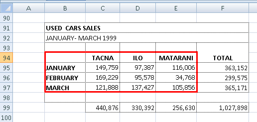 |
| You must select the data as it is shown in the example including the headings and tittles. With this Excel graphic you can show the evolution in profit or loss in a determined period of time. |
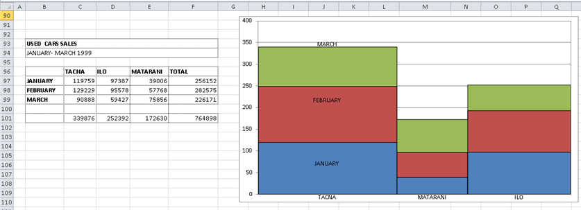 |
| Note: In order to generate this type of Excel graphic is necessary to create a hidden sheet (the sheet will be automatically created) to format the data which will allow to show grouped series. The sheet TEST.CHART. is created, which will make reference to the Excel graphic data. This kind of Excel graphic does not allow to display changes from the Excel graphic data directly, it will be necessary to create a new Excel graphic to show modifications in the data. |