| Insert Bump chart |
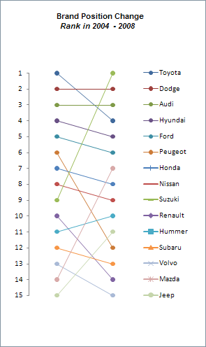
| Bump charts have become quite common of late and are typically used to represent changes in the position of a given number of competing entities over a fixed time duration. |
Through this graphic you will be able to show how fast and based on positions, the improvement or loss of positions related to competitors. |
| Now, with Spreadsheet Dashboards Tools, inserting these bump charts will be easier and you will be able to see changes in your data immediately. |
| To create this type of graphic You need to group your data in the following way: |
|
|
|
 |
Now, simply select the range B4: D18, as shown in the example. |
 |
| Choose where to insert the Excel graphic. |
| As a result the Excel chart has been generated successfully. |
|