| Double Doughnut |
 |
|
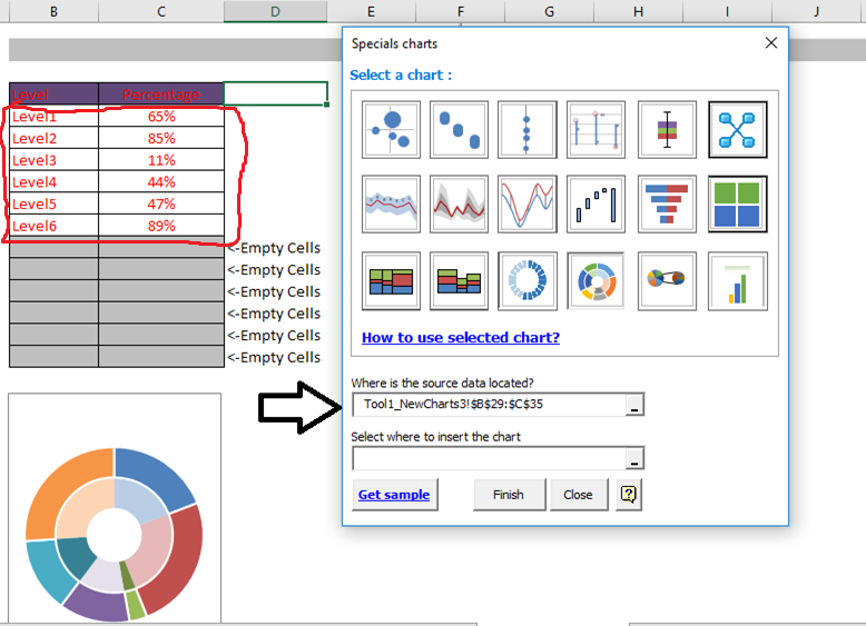
This custom Excel chart improves the classic pie of Excel, adding a level to be able to visualize the labels at a glance. You can quickly see important information in your reports in a very fast way. Note: It is important to observe the series. How the chart is created in the example. For this graph you must choose the data without considering column headers That is, if you have a series of months you should not choose a title of rows above, only from the headers of the months for example That is to say, only the data inside the red border, the system will take charge of taking shape the empty rows |
You must select the data as it is shown in the example and insert. |
 |